CNP Vita Intranet


The client
CNP UniCredit Vita is the insurance partner of UniCredit S.p.A., a subsidiary of the French Group CNP Assurances S.A., which, with more than 170 years of history in the European insurance market, offers the tradition and experience of an internationally recognised institution through strong partnerships around the world.Its mission is to offer insurance services and products to respond concretely to the need to protect persons and their assets at every stage of their clients’ lives.
In Italy since 2005 with the partnership with UniCredit S.p.A. (CNP UniCredit Vita).
From 2021, after the acquisition of Aviva’s life companies in Italy, it also operates in the open market with a multi-partner model (CNP Vita Assicura and CNP Vita Assicurazione).
The objective
To devise a suitable environment for creating and maintaining a genuine new internal digital community, a tool that could support the remote corporate community.
The challenge
The challenge developed on four main pillars.
A comprehensive and up-to-date intranet
The desire is to provide up-to-date information from different company departments to give visibility to the organisation and not exclude any part of it. Along with this, it was important to set up a space that encourages return opportunities where entering each day becomes a pleasant and useful routine.A personal tool
Give users the opportunity to feel the intranet as a personal tool that adapts to their needs and allows them to create unique paths tailored to each member’s professional and personal needs.A community space
The shared sentiment is to allow all members to feel the presence of their colleagues even at a distance, thanks to community tools and content presentation strategies that leave room for community use.An open platform
In order to go beyond the dynamics of traditional unidirectional intranets, the new platform must be designed to be open to users by involving them and allowing them to be the first protagonists of the change, while at the same time adapting to their needs and desires.The solution
Starting from the four pillars mentioned above, we defined a project concept from which we derived design, functional and implementation guidelines.
Designing a working tool for CNP Vita Unicredit employees to use on a daily basis, to which it would be pleasant to return each day and in which it would be easy to carry out their tasks, required us to focus first of all on a usable design, in line with the brand identity, but oriented towards making each action easily identifiable and reducing screen-fatigue.

Already in the choice of colour palette and atomic design elements, an attempt was made to choose navigation patterns and minimal, clean layout structures that could accommodate lists, documents and different types of communication in a clear and intelligible manner at all times.
We continued with user-centred design by retracing the most frequent contexts of use. Some functional choices, for example, derive from the awareness, identified during the assessment phase, that users were often called upon to operate on a recurring set of contents depending on the time of year, and that many times some contents ‘seen’ in the list during a quick scan of a page, and considered interesting, had to be retrieved later by the user, at a quieter time when it was easier to read in depth.

In a process of co-design, made fluid by the constant sharing with the client of wireframes in middle fidelity and of navigable UX and then UI prototypes, the development was flanked by a constant review of requirements and implementation priorities, with the aim of bringing into production an initial version complete with all the basic functionalities, but open to evolutions following user usage.
Administrators and editors have access to an administrative area complete with moderation tools and statistical reports, with the integration of external analytics tools such as Matomo.
On the other side, each user has customisation and support tools to simplify his or her work and meet the characteristics of the context of use, such as: lists of favourite contents, bookmarks of important documents, reading lists for articles and communications to be read later, shortcuts to be added to one’s toolbar.
On the community front, there was a desire to provide features more oriented towards facilitating interaction with others, such as the possibility of interacting with comments and reactions in different areas of the application. Furthermore, employees in the new Internet have the opportunity to actively participate and can, for example, create announcements for the company notice board or suggest terms for the glossary.

Any curiosities?
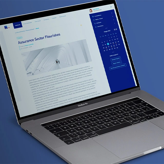
The opening block of the user dashboard includes the weather, an example of a quote of the day and the number of users online. But other features are to be expected, small ideas and tricks to entertain, engage and interest participating users:
- It will be possible to choose a quote of the week to be shown in the area under the weather
- It will be possible to choose a news item or event to be shown in the 'Featured' area using the 'Promoted to front page' option
- Highlighted news may be marked as 'Urgent' and appear in a graphic style that highlights its relevance
- The latest published news will be shown in chronological order
- Using the 'Promoted to the front page' option, an event can be shown to be highlighted in the dashboard
- The 'Corporate Library' section will present recommended topics and a list of the latest uploaded documents
- The 'Latest Updates' section will show a list of the latest modified pages (information pages and information systems page), with the date and time of modification
- The 'Company Notice Board' section will show the last two announcements posted on the notice board and give the possibility to add new ones
The results
The platform went live and was very successful in terms of acceptance and adoption.
The Italian intranet then also became a model for their French counterpart colleagues, who requested a clone.
Key Results
Technologies Used
CMS
- Drupal
- PHP
- Twig
Frontend
- JavaScript
- SCSS
- Responsive Design
Analytics
- Matomo
- Dashboard
- Reports
Methodology
- UX Research
- Wireframing
- Prototyping

Elena Trussardi
Head of CSR, Internal Communication & Events in both companies


